May 7, 20207 min read

The mobile apps market is booming. According to Statista, currently, there are over 2.5 billion Android apps and nearly 1.9 billion iOS apps available. As these numbers are hitting new heights, mobile designers are facing an uphill struggle trying to create a unique application that gets noticed. That’s not to say it’s a lost cause.
Does your existing mobile app need an upgrade? Are you planning to build a brand new application that will wow your users? Or maybe you just love all things UX and UI and always keep your eyes open for useful tips and recommendations?
Whichever it is, you’ll want to check out the following 31 UX and UI design rules for irresistible mobile apps that sell like crazy.
Seamless Mobile App Flow
1. Maintain design consistency.
An enjoyable mobile app user experience needs to be consistent. Keep the typeface, colors, images, and controls uniform throughout your app (and all devices) to enhance usability and eliminate confusion.
Revolut delivers a coherent user experience across all screens
2. Remove user doubt.
Whenever a user interacts with your app, remove uncertainty by providing feedback. Communicate the statuses and the expected outcome of each operation. For example, display a pop-up message on form completion or add a progress bar/message to let users know they need to wait.
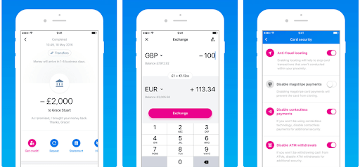
3. Reduce the number of steps.
Simplify the user’s journey with your mobile app by minimizing the number of steps they need to take to reach their goal. How? Avoid long forms, optimize your app for auto-fill, and embrace one-click features.
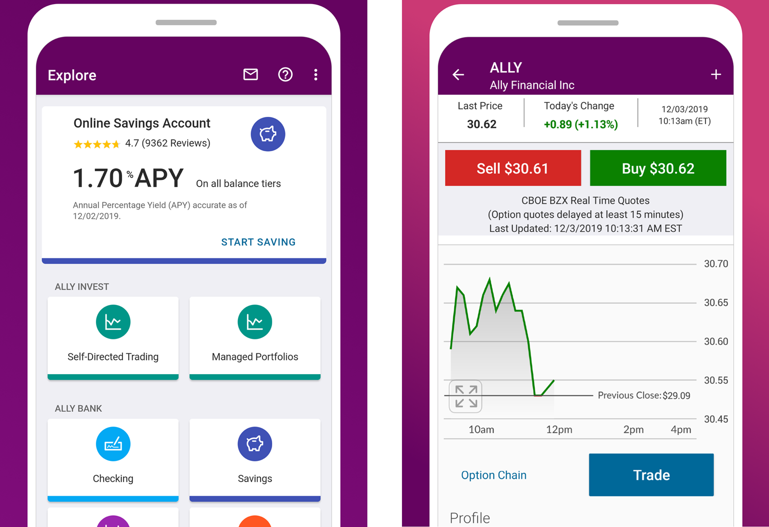
Ally, a mobile banking app, simplifies all key banking services down to a single tap
4. Break down user actions.
Try to prioritize one main action per screen only (e.g., logging in, providing parameters, choosing an item, confirming an operation), and make it explicit by using a distinct color or shape. If you include any secondary actions, don’t let them compete with the primary.
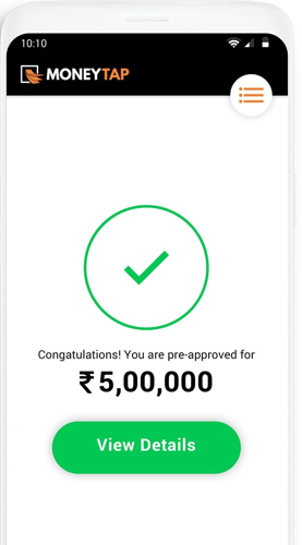
The MoneyTap app sticks to the UX principle: one screen=one goal.
5. Trim your interface.
Anything that stands in the way of your users quickly accomplishing their goals is a needless distraction. Remove all obstacles—get rid of all clutter, redundant content, and unnecessary UI elements. Stick to essentials.
6. Prioritize UI elements.
Place vital elements near the top of the screen, and arrange all sections in the descending order of importance. Experiment with whitespace to increase readability and call the user’s attention to critical content.
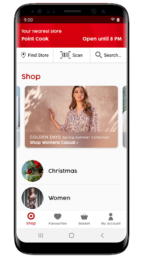
To highlight essential information, Target keeps it at the top of the screen
7. Make scrolling intuitive.
Use a horizontal scroll to browse through a catalog of items (e.g., a selection of products) or to display information on a large visual area that wouldn’t otherwise fit the screen (e.g., a map). Always provide a visual hint that there’s more content available, and indicate the direction of scrolling.
8. Consider tab bars.
Tab bars appear at the bottom of the screen, allowing users to quickly and conveniently switch between different areas of an app. They enhance app navigation, save space, and make it easy to find the desired features. To use them effectively, use no more than 3-4 tabs, and don’t hide the bar when your users transition between different screens.
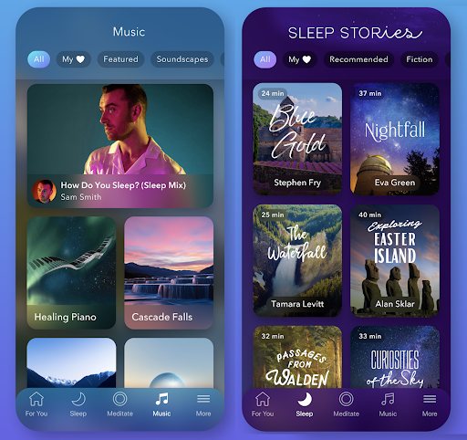
The tab bar in Calm offers immediate access to various meditation resources
9. Ensure a smooth transition from portrait/landscape orientation.
As you develop your mobile app, remember to align it with changing device orientations. From the users’ perspective, the transition between portrait and landscape modes as they rotate a mobile device should be seamless. Ensure that no content is lost as the view switches.
User-centricity
10. Create different user paths.
To support users with different UX preferences, deliver several ways to accomplish the same goal, and bring them together neatly with design. If possible, offer different input methods and allow a few login options. Let the users decide how they interact with your app.
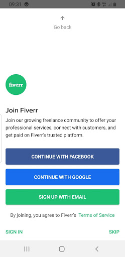
Freelancers get several different signup options to join the Fiverr service
11. Keep it simple!
If you bombard your users with information, they are likely to get confused and leave. Don’t let users perform calculations, fill out endless forms, or decipher abstract images. Make your app figure out those things instead, by providing hints, cues, and auto-complete features.
12. Adjust your app to the user’s level.
Adapt the onboarding strategy to your target users to make your app compatible with their skills, background, and level of familiarity with mobile software and devices. Business audience or Millenials won’t probably need much hand-holding, while beginners will surely appreciate a guided walkthrough through your app to get a solid grip of all functions. Regardless of the user level, always include gesture-driven interactions in onboarding to people who have just downloaded your application.
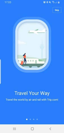
Trip.com does an outstanding job when it comes to fast and efficient user onboarding
13. Embrace familiarity.
Reduce the user’s learning curve by applying familiar, standardized layouts and icons. Make sure that all UI elements clearly indicate their function. For instance, use an envelope symbol to trigger sending a message and a phone symbol for a one-click call action. When in doubt, put usability before creativity.
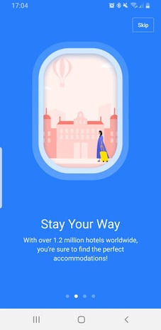
14. Leave room for personalization.
Take advantage of the power of data to improve your UX with personalization. Use the information about the user’s location, past searches, and previous purchases to craft special offers. Leverage tailored in-app and push notifications to delight your users with hyper-personalized experiences.
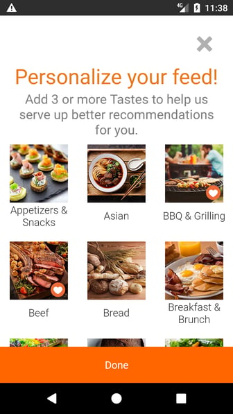
Allrecipes Dinner Spinner lets users personalize their feed with tailored recipe recommendations
15. Minimize data input.
The more data you ask of your users, the higher the risk of them quitting your app. To show respect for your user’s privacy, reduce all forms to only the essential inputs, always explain why you need particular information, and provide an option to skip optional steps.
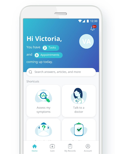
16. Offer user assistance.
Whenever your users get stuck, make sure you’re there to support them. Offer diverse ways for them to receive assistance through your app, from live chats and chatbots, through in-app native FAQS, to click-to-call customer support buttons.
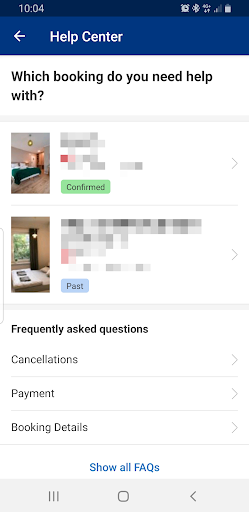
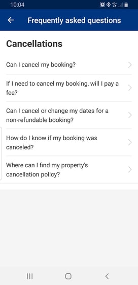
When in trouble, users of Booking.com can easily get support with their recent reservations
Ease of Use & Accessibility
17. Design for one-handed use.
Research shows that nearly half of mobile users hold and operate their smartphones with one hand. That’s why it’s essential to group all crucial interactions under the user’s thumb. There are many ways to achieve this, including left-right swiping, a popover window, or a tab bar.
Evernote provides one button that groups critical options within a thumb’s reach
18. Ensure high image contrast.
Mobile apps are made to be used on the go, indoors and outdoors. By choosing high contrast images and avoiding gradients, you can ensure excellent visibility for your app in varying light conditions, especially on glossy screens.
19. Avoid random color choices.
The right choice of a color scheme may help you differentiate your app and your brand, making a lasting impression on your users. Your mobile app’s color palette ties together various complex aspects, yet several working rules remain universal:
- Design in grayscale first.
- Avoid excessively bright or glowing colors.
- Reflect your brand’s palette.
- Ensure appropriate color-contrast ratio.
- Accommodate color-blind users.
The clean and concise color scheme in Babbel, with one dominant color, keeps learners active and focused
The Freelancer app plays with a rich, yet well-balanced color palette to differentiate between its service categories
20. Design finger-friendly.
Mobile screen sizes change every year, but tiny touch targets continue to be a pain for clumsy human fingers. To save users the annoyance of struggling to tap the right element in your app, while designing, ensure the right size of all interactive features and ensure enough padding around them. Stick with the button height of at least 42 pixels, and 72 pixels max. The most preferred button size is, in general, 60 pixels.
21. Let buttons be buttons.
If you want to give free rein to your imagination, button design is not a place to do it. Visual elements that seem clickable but aren’t interactive confuse your users. To avoid it, clearly label buttons with their action and use familiar shapes and colors. Make each button look like a button.
22. Make clickable elements recognizable.
Size all UI elements according to their prominence (large size=important feature). Make the primary action buttons, icons, and hotspots conspicuous by applying a color that captures the user’s attention. Play with whitespace and padding to make clickable elements stand out from the background.
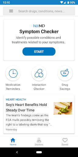
WebMD prompts user actions with easily discernible buttons and meaningful icons
23. Adjust display settings to enhance app’s accessibility.
Make text easier to read by allowing users to adjust the size, color, and brightness of your application, independent of the device settings. Enable pinch-to-zoom for users with low vision.
The Pinterest app offers a dark and light viewing modes, for users’ convenience
24. Check your font sizes.
A standard recommendation for font size in mobile design is at least 16px. Ideally, use no more than two-three sizes for different content types. Be careful with headings as large fonts may cause your lines to contain 1 or 2 words each. Always view your app on a device before you push the code to production.
25. Keep font styles readable and consistent.
Typography plays a crucial role in mobile UX & UI design and requires deep thought. In general, try keeping the number of font styles to the minimum. Remember that sans-serif fonts are easier to read in lower screen resolutions. Also bear in mind that italics are difficult to read, especially for users with dyslexia. The same goes for ALL CAPS, so text where all letters are capitalized. All caps work well with logos and acronyms but when you overuse them for titles and headings, they slow scanning speed.
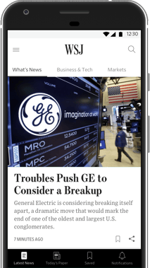
News aggregators like Google News or BBC News usually go with simple, sans-serif fonts, while mobile newspapers like WSJ or The NYT often blend them with more traditional styles
26. Educate your users about gestures.
Gestures allow users to achieve goals quickly and in an engaging way. Unfortunately, they are hidden controls, so your users won’t usually try them out automatically. They also haven’t been standardized, which makes the task of discovering them even harder. To make the user experience with gestures more natural and accessible, aid users with visual cues and animations demonstrating how to interact with your app content.
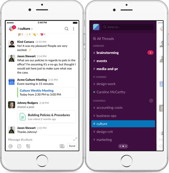
Slack boosts productivity with gestures. For example, you can access the navigation menu with a right swipe
27. Make searching easy.
Users appreciate the search feature in all mobile apps, as it dramatically reduces their efforts. To implement it in a user-friendly way, place a search bar or function at the top of the screen to make it easily discoverable. Additionally, power your search functionality with suggestions, auto-complete, and save search history.
In Healthtap, users can easily find answers to any health-related question through the search bar
Performance
28. Design for optimized performance.
Sluggish performance is among the top reasons for mobile app uninstalls. That’s why it’s crucial to embed performance optimization into your app design from day one by:
- Decreasing the total app size as much as possible.
- Loading textual data first, before images.
- Caching and compressing image-based content.
- Reusing templates across the app screens.
29. Use skeleton screens.
To create an illusion of speed, use temporary containers (skeletons) as placeholders until your content loads. By immediately showing the screen and gradually loading the content underneath, you will make your app seem more stable and fast and keep impatient users.
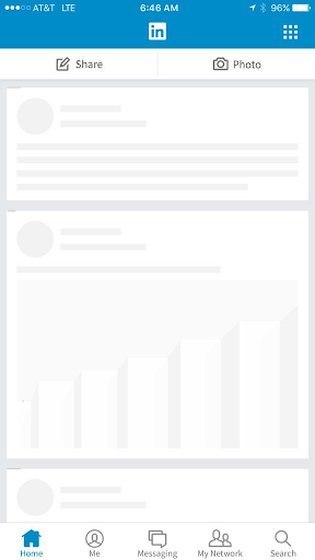
LinkedIn app’s skeleton screen
30. Embrace distraction.
If your app needs time to complete an action, entertain your users. Turn their attention to an interactive animation or pop an interesting fact as a distraction. Ensure that while your users are waiting, your app can maintain the background state to bring them to where they left off without losing any information.

Divert user attention with a morphic loading screen (credit: Valentin Salmon)
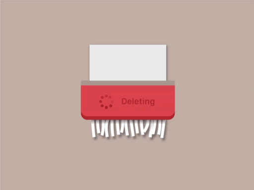
Entertain users as you’re waiting for files to be deleted in your app (credit: Hanna Jung)
31. Reaffirm the user with haptics.
Reinforce the sensation of touch in your mobile app for simple operations, not only to enhance the user experience but also to buy more time to execute an action. Haptics produces an immediate feeling that an action has been already triggered, even before your software starts processing it.
Your Winning Mobile App UX Design
There are many moving parts to designing a mobile app, and coming up with a truly unique application that ticks all the boxes may sometimes be challenging. However, applying the above UX best practices increases your chances of creating a mobile app that attracts, engages, and converts your target users.
Joanna is a veteran content writer and translator with hands-on experience in IT and marketing.
View all author postsTrending articles
21 Dazzling Examples of Mobile App UI Design to Inspire You in 2023
Michał Pruciak 7 min read
MedTech vs HealthTech vs BioTech: What Are The Differences?
Michał Pruciak 7 min read
10 Business Applications of Neural Network (With Examples!)
Michał Pruciak 4 min read
10 Irresistible Examples of Web Design Best Practices for 2023
Adam Kozłowski 7 min read
28 Amazing Examples Of PHP Web Development
Dawid Karczewski 14 min read

We believe in the power of sharing knowledge and expertise:

Looking for a specific type of design service?
Looking for UX/UI design experts to join your team?
There are dozens of vetted UX/UI professionals in our talent network.


