Apr 20, 20227 min read

As you read this article, there are over 1.1 billion websites worldwide in total. And dozens more—175 to be exact—are created each new minute. With thousands of websites going live every day, companies vie for consumers' attention, especially in crowded markets like e-commerce.
Meanwhile, every second consumer says that a website design is important to a company's image. So what can a brand do to create one of the chosen few websites that get noticed, acknowledged, and remembered?
Web design—like the entire digital industry—never stops changing. Remember neumorphism? It went from hot to not alarmingly fast. Well, at least in its original form (we'll get to that later).
So how can you keep up with the current web design best practices to ensure your website attracts and wows your target audience? To start, check out a resource like this one, where we reveal unique websites representing the design trends that will dictate how the web looks this year and beyond.
1. One-page website—Vaayu (real estate)
What we love about this design: single-page structure, easy navigation, simple but distinct color palette, scrollytelling
Vaayu's website design screams minimalism: from the use of just two colors and fonts to fitting all the content on just one page. Still, the website never feels austere, thanks to animations, horizontal scroll, and bright yellow accents. Plus, all these elements align perfectly with the brand's mission to help businesses minimize their carbon footprint.
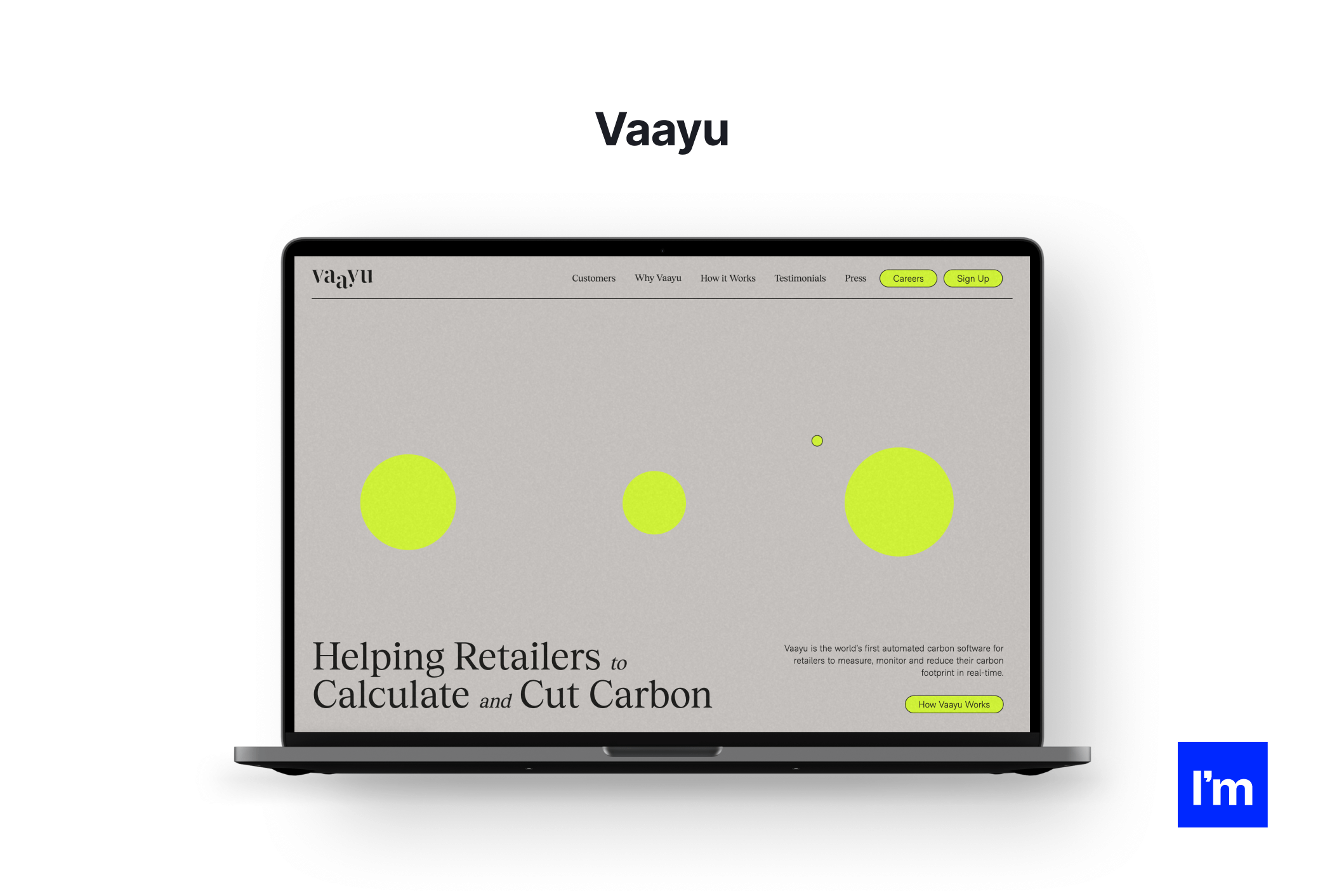
Sometimes all a real estate agency needs to make a lasting impression is a single page
The continuity of single-page websites allows designers to present content without the friction of clicking and waiting for subpages to load. Scrollytelling (a hot design trend in itself) takes visitors on a captivating journey instead of nudging them to click that "About Us" link. Add to that a variety of media and interactions, and you're about to win your visitors' attention all the way down to "Privacy Policy."
2. Interactive pointer—Wild Souls (e-commerce)
What we love about this design: playful pointer, pastels, interactions galore
Carousels, animated buttons, highlights, and eye-catching (but never gaudy) colors are enough to urge visitors to explore every product by Wild Souls. The cursor that turns into an eye when hovering over an item is a cherry on the top, making them even more curious to take a peek inside.
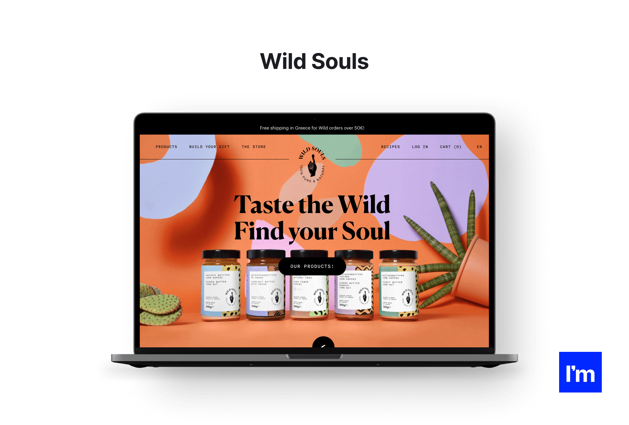
E-commerce websites are all about product presentation, and Wild Souls grocery sure knows how to do it right
Interactive cursors have been gaining popularity among web designers for some time now, and it's easy to see why—they're fun and functional. Another example from Wild Souls is that instead of your run-of-the-mill photo carousel, they opted for stacked cards with images. Mousing over one of them turns the pointer into an arrow, encouraging the user to flip the card and reveal the next one. Neat!
3. Linework—Harvard Film Archive (culture)
What we love about this design: linework, clear layout, micro animations, retro look
The website of the Harvard Film Archive is a small but precious minimalist gem that looks like a printed vintage cinema bulletin. Fine lines and dividers enhance navigation and help build a transparent structure. The same can be said about subtle animations that are satisfying and hint at the website's interactive elements. Even the vintage camera-styled loading screens feature thin contours that evoke retro imagery.
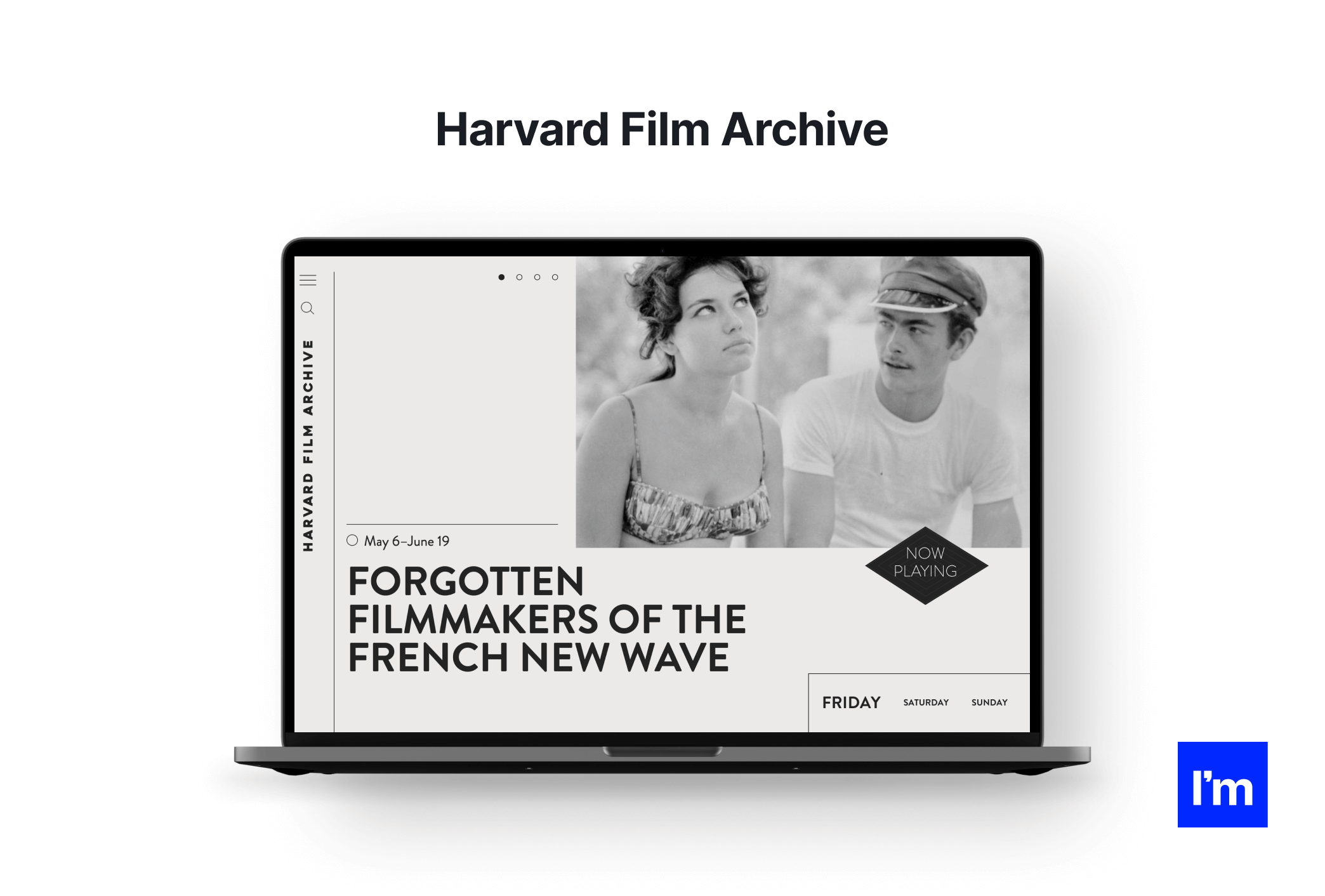
True, minimalism is nothing new. But why let go of something that works so well?
Linework and outlines are a simple and effective way to separate website content and drive users' attention toward the elements that matter. And by using them, a website designer can cut down on other graphic elements typically used for that purpose, such as color, typography, or contrast. The result is a clean and harmonious web design without clutter and visual overload.
4. Memphis style—Mapbox (online maps)
What we love about this design: dark mode, Memphis-inspired style, simplicity, single-page structure
Websites like one of the Maptober challenge by Mapbox show how to incorporate past trends into the design to breathe a new life into current web projects. Although the challenge is now over, its page stands as a stellar representation of the back-in-vogue Memphis style that we'll be seeing more of in 2023. Bright colors, abstract shapes, and bold geometry are all there, augmented by simple but engaging animations. All that together results in a website that feels retro and futuristic at the same time.
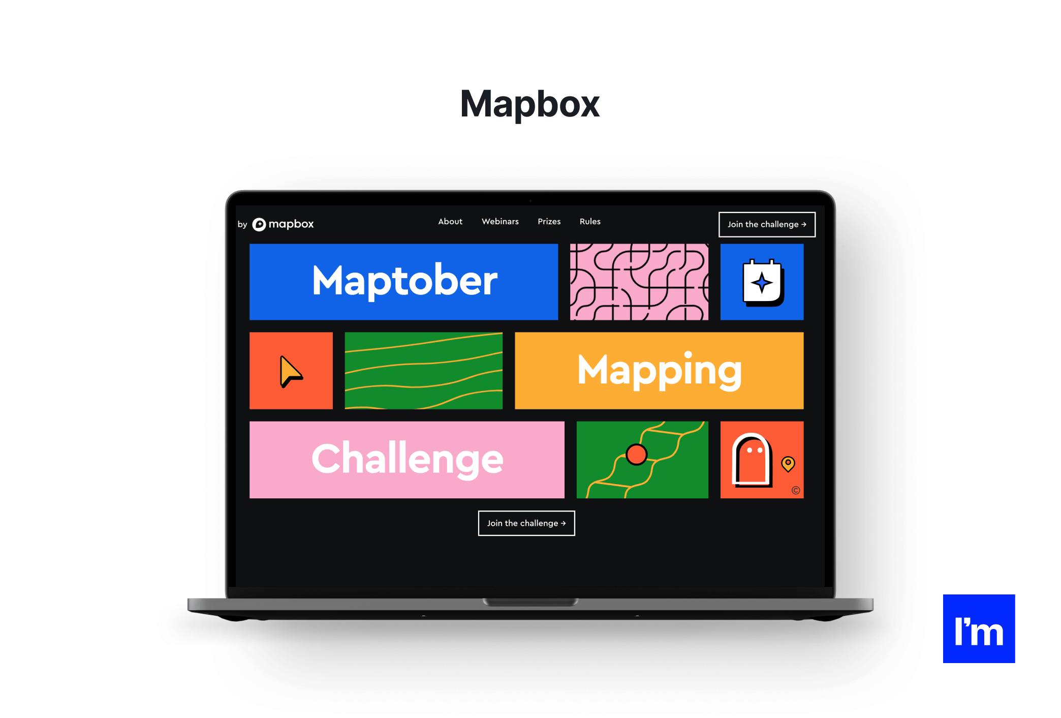
The current '90s craze and previous nostalgia-driven design trends prove that we invariably love to go back in time
What's great about the Memphis style is that it pairs vivid colors with a black backdrop. Thanks to these colorful accents, dark mode no longer has to look dark. At the same time, the website remains accessible to readers and puts less strain on users' eyes.
5. Claymorphism—Potion (content platform)
What we love about this design: claymorphism, white space, typography gigantism
Neumorphism was the web design trend of 2020 and 2021. Slick, light, and tactile, it quickly rose to the top. And then, just as quickly, it started to fade away.
Still, it managed to make its mark on the trends yet to come. One of them is claymorphism. It's the new go-to visual style for designers who dig clean feel, toned-down colors, shadows, soft corners… and fluffy 3D renders. You need examples? Take a look at Potion's website. It's a mix of pastel hues of purple, tablet-shaped boxes, and an adorable wizard-cat-in-a-hat brand hero to top it off.
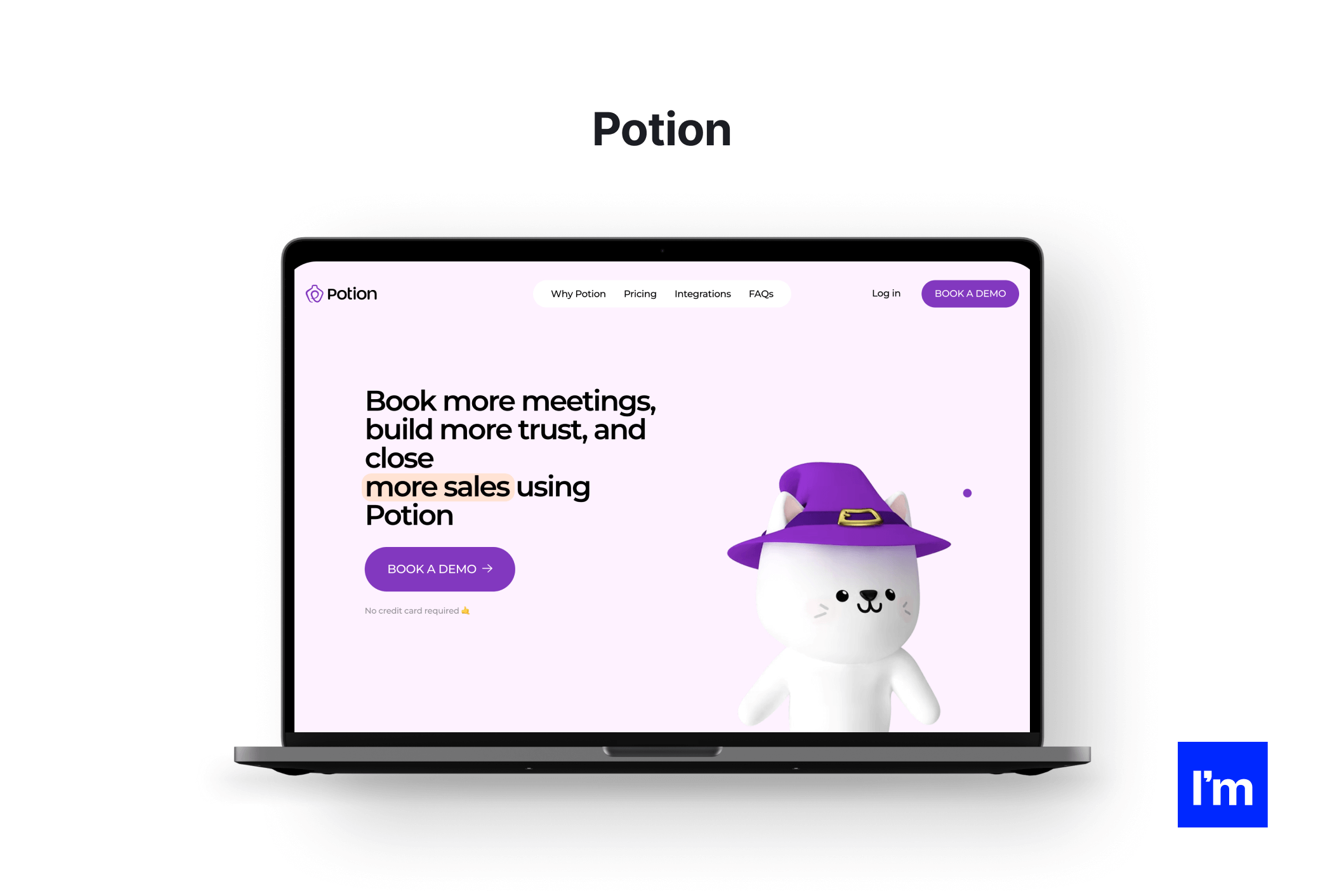
One big benefit of claymorphism is its flexibility—if done right, it can serve every customer-faced industry, be it SaaS, e-commerce, fintech, or even healthcare
A website designer can pick and mix different features of this trend to fit the purpose of virtually any website or digital product. This makes claymorphism a perfect and safe option for brands that want to show a friendly and accessible attitude.
6. Glassmorphism—CSIC (scientific research)
What we love about this design: glassmorphism, abstract shapes, novel approach to governmental websites
Claymorphism isn't the only -ism on this list; meet its glossy cousin, glassmorphism. More of a technique than a full-fledged style, it owes its name to its key features: transparency, reflection, blur, and shadow, which create the effect of frosted glass. This effect can give every website a modern and spacious feel. Just look at this star of a website by The Spanish National Research Council, CSIC.
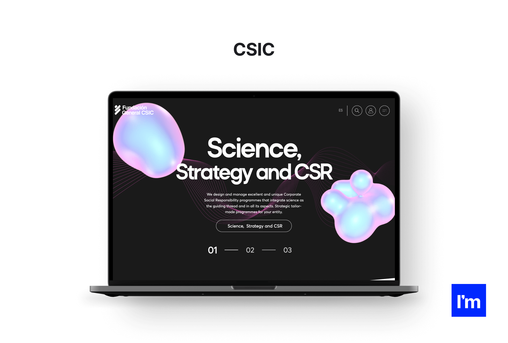
If you thought that state-run websites were boring, the CSIC webpage will make you change your mind
There's a reason why glassmorphism is used so sparsely—all the shine and bright colors can easily get overwhelming for the user. Therefore, balance it with a darker background to achieve optimal results. Another use of the technique is in places you want visitors to focus on. Vibrant shades of blue and pink are quite a heads-turner!
7. Typography-based hero pages—re_ (retail)
What we love about this design: minimalistic hero page, typography, usability
The first impression is key for keeping visitors around for longer, and that's exactly what hero pages are for. True to the latest hero page trend, re_ grocery focused on typography and opted for a large brand name in a serif font. As a result, the visitors immediately recognize the company's fundamental trait—simplicity. This image is then consistently communicated across the website through the orange/beige color palette, neat layout, and minimalist product photos.
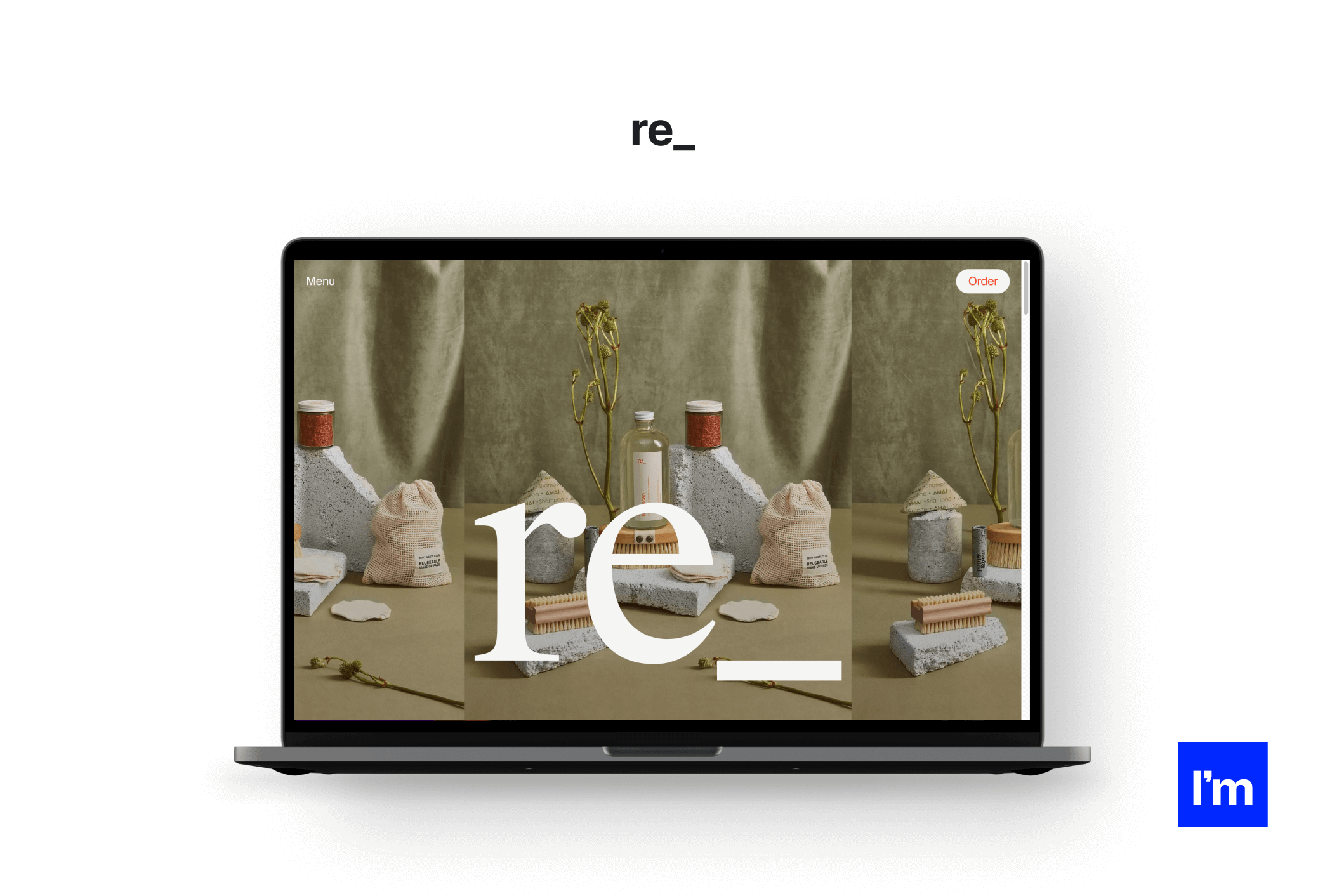
Notice how the website combines serif and sans fonts to feel modern and traditional at once
The minimalism/typography combo surely looks intriguing, but keep in mind that it won't necessarily go well with all brands. An important factor to consider is complexity. More sophisticated products or abstract services may need more than a single page to introduce. If that's the case, instead, use the hero page to convey the essential purpose of the product and appeal to visitors' needs to get them invested.
8. Brutalism—Curry Café (food & drink services)
What we love about this design: brutalism, movement, wild colors
Curry Cafe went all-in with a design that reminds a poster or food package rather than your ordinary restaurant website. Sensory overload is contrasted with a simple, single-page structure, while vibrant, sticker-like icons complement grainy photos of the meals. It's a prime example of brutalist web design, which—unlike its architectural counterpart—makes ample use of lively colors and decorations but—similar to it—is raw in form. Brutalism throws all rules out of the window, so each website designed in this style stands out in its way.
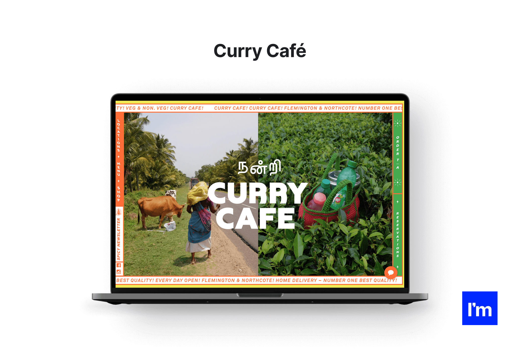
Hero pages work wonders when it comes to grabbing visitors' attention. But what if your entire website does that?
That being said, this approach often sacrifices usability for originality, which makes the trend a definite no-go for industries like finance or healthcare. Still, if you seek to impress and surprise (or straight shock) your users, brutalism will deliver. You'll encounter it where originality and creativity matter: in web designer portfolios, festival websites, or fashion e-commerce.
9. Experiential websites—Dr. Dabber (recreational)
What we love about this design: motion interactions, media, visual coherence
On Dr. Dabber's, the word "experience" is key since its goal is to present various pen models as realistically as it gets to entice potential buyers. And entice it does: meticulous 3D renders that float, shine, and react to cursor movements give the hands-on feel of the product. If you want to get even nearer, the website offers a close-up of the vaporizer that allows you to see all parts in the minutest detail. The website is a true scrollable spectacle with high-quality clips, moving typeface, minimalistic color palette, and soft ambient music.
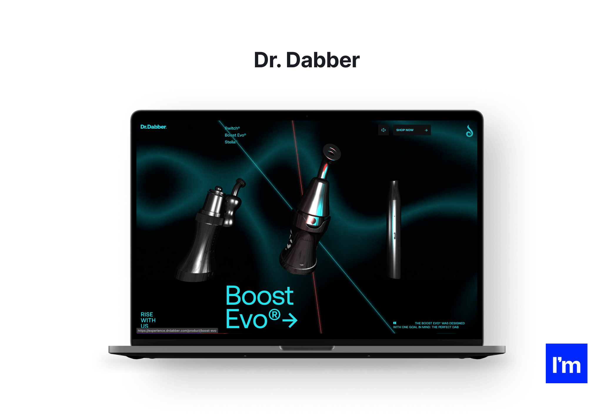
Do you know that feeling when a website is so delightful that you simply can't stop scrolling through it?
Now, we're not telling you to put animations in every single website element. However, in 2023, experiential websites that are irresistibly pleasant to use will undoubtedly become one of the dominating design best practices. Incorporating interactive buttons, motion, media, varied textures, and other seemingly excessive features will go a long way if you're trying to engage visitors not just with the website but with your brand and product.
10. Visible grids—Salus (skincare)
What we love about this design: exposed grid, transparency, double scroll
Today, web designers are well aware of the advantages that revealing a website's backbone can bring. It's particularly suitable for e-commerce, where products can be displayed in separate "cells," just like in Salus's case. This structure is easy to navigate and allows a web designer to weave in images and features like a dual scroll seamlessly.
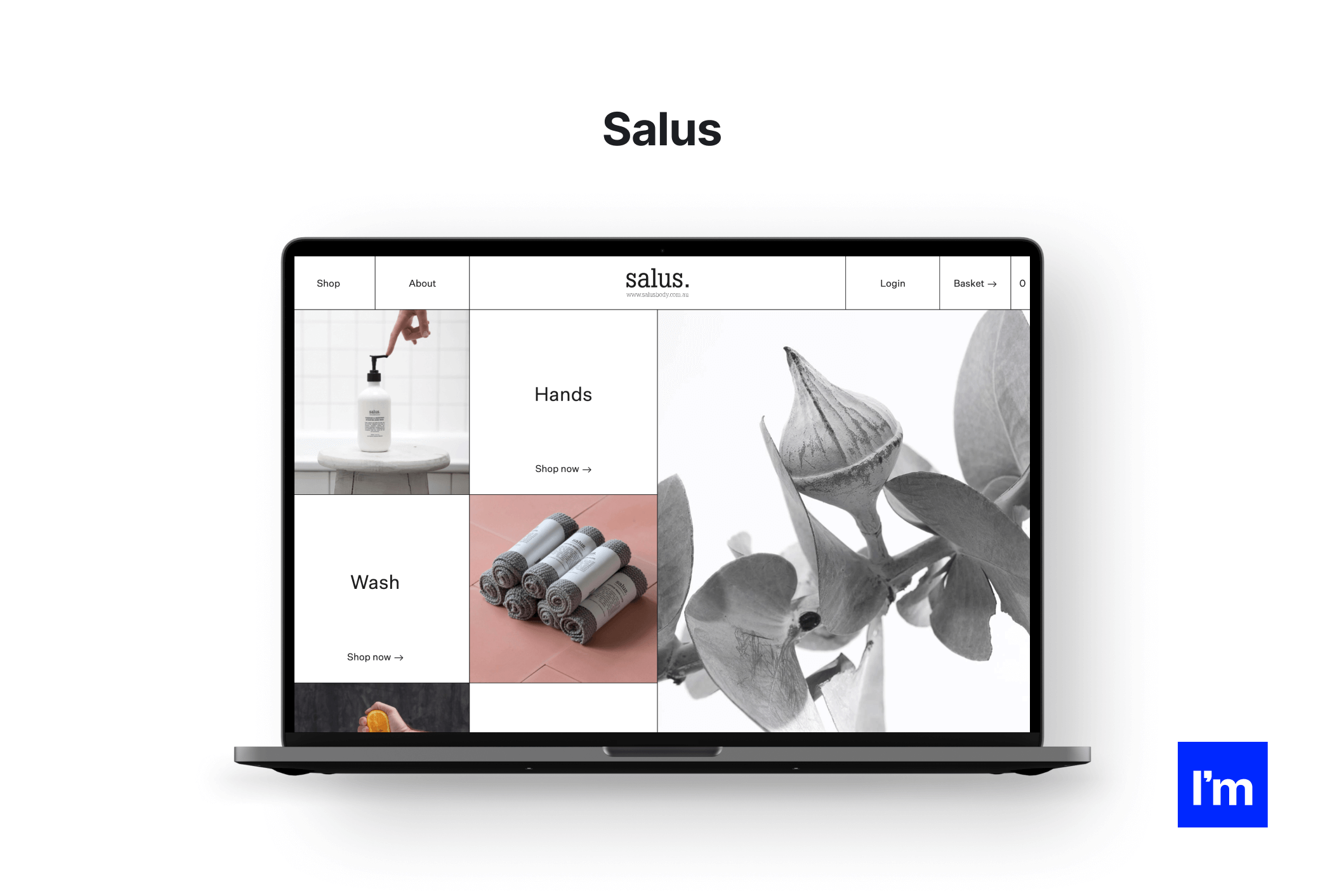
For a long time, grids used to be nothing more than a tool; now, they've gained a meaning
Revealed grids are flexible enough to be applied in many industries. One interesting use case is blogs and other text-heavy websites; grids provide enough visual interest to allow fewer images and media without making the page look dull. What's more, thanks to their blocky structure, grid-based websites easily adapt to various screen sizes, following responsive design principles.
Time to nail these 2023 web design best practices!
There you have it—our top web design best practices for 2023. We've just scratched the surface here, and this year will surely still bring many other notions. One thing is certain: with the trends discussed in this article, we're in for a period of creativity and exciting new designs!
Feeling excited about what's fresh in web design this year? We sure are—and so is our team of creative website designers. They can't wait to hear your ideas and put these new web design best practices into action, so reach out to us and let's talk!
Designed the first website around the year 2004 and since then worked in various fields of design like branding, advertisement, and product design. Currently focused on UX/UI and consulting for a robust approach to results-focused applications.
View all author posts
Trending articles
21 Dazzling Examples of Mobile App UI Design to Inspire You in 2023
Michał Pruciak 7 min read
MedTech vs HealthTech vs BioTech: What Are The Differences?
Michał Pruciak 7 min read
10 Business Applications of Neural Network (With Examples!)
Michał Pruciak 4 min read
10 Irresistible Examples of Web Design Best Practices for 2023
Adam Kozłowski 7 min read
28 Amazing Examples Of PHP Web Development
Dawid Karczewski 14 min read

Looking for a specific type of design service?
Looking for web design experts to join your team?
There are dozens of vetted web design professionals in our talent network.